Attack on Timetable: S2 (Sasageyo)
This is the second instalment of the timetabling trilogy, where we explore why you should be using Notangles and not Crossangles to plan your uni timetable. In case you missed the first part, you can read it here. For this article, we will explore how the two apps handle clashing classes.
Overlaps, overlaps, overlaps

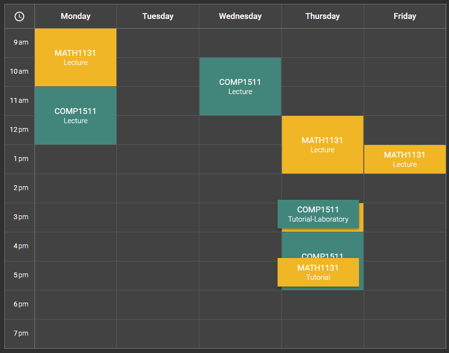
Like before, let's have a look what Notangles is up against. Crossangles takes a no-frills approach to handling clashes - they simply stack cards on top of each other. There is a small gap to allow for the user to click on any cards underneath and bring them to the top, but it is difficult to understand what is happening with your timetable at a glance. If only the cards were arranged side-by-side so you can still see what classes are scheduled...
No overlaps!

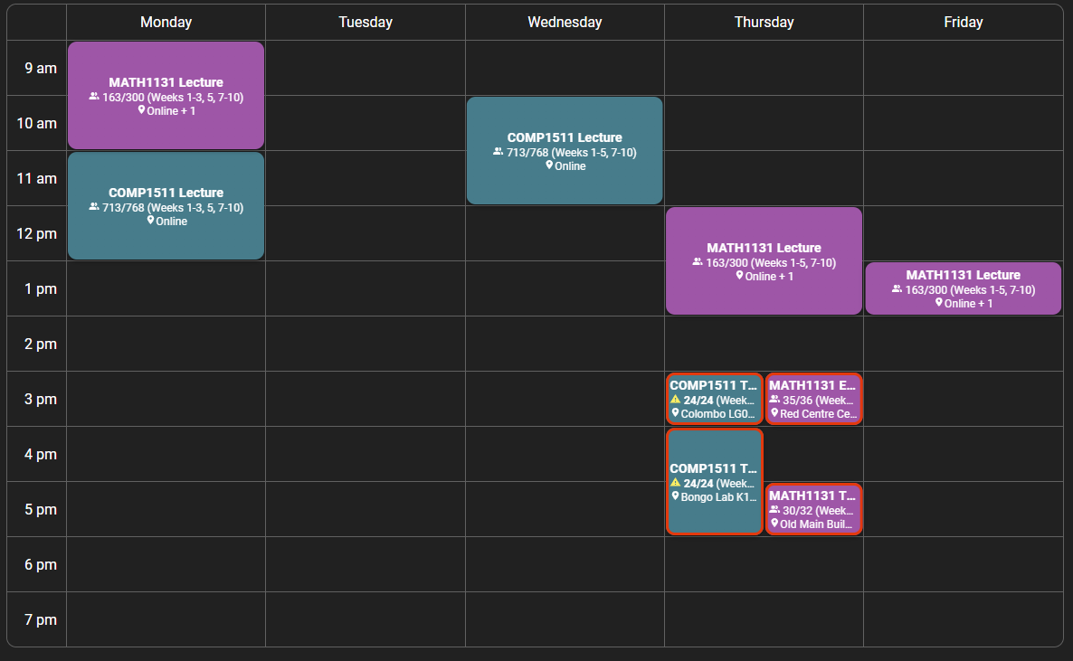
... which is what Notangles does! Here, the space of a single grid cell is divided equally between all classes occurring in that time slot. You can just see enough information to know what classes are going on, and any clashes are highlighted with the appropriate colour - red for non-permitted clashes, orange for permitted clashes, and no highlighting for clashes with a custom event. We have defined a non-permitted clash as any non-lecture class with any other non-lecture class - that is, a clash is permitted if one of the classes is a lecture.
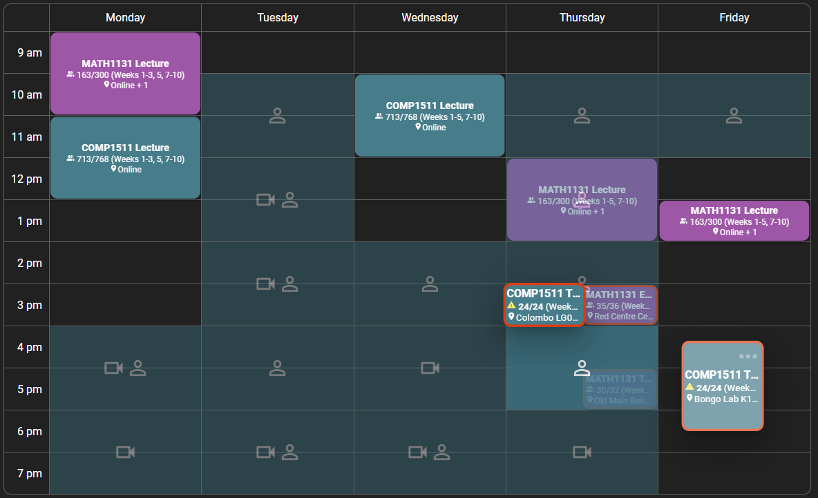
So, how do we do it? First, a quick introduction on how Notangles positions the cards in the timetable. This may come as a surprise, but the grid itself is merely an outline - the cards aren't bound to the lines of the grid at all. Instead, we define a second layer of dropzones - these are the locations where a card can be dropped. When a card is released after dragging, if it is currently located over a dropzone, it will be dropped there. If not, it will be returned to its previously dropped location.

Now, the question is how the dropzones are created in the first place. To do this, we simply spawn all the dropzones at the point corresponding to Monday 9am, each with a length of one hour. Then, we use some helper functions to return the CSS required to translate the dropzone to its correct location, based on when a class occurs, and to adjust its height, based on a class's duration. These functions can be found in translateCard.ts.
Back to calculating clashes. As a first step, we find every class which is clashing with at least one other class. Two classes are clashing if the following succinct snippet is true:
period1.end > period2.start && period1.start < period2.end) || (period2.end > period1.start && period2.start < period1.end)
Next, to simplify calculations, we group each clash by day and starting time. This is stored in an array of arrays, where the first subarray corresponds to Monday etc. Sorting by starting time allows us to nicely display classes which don't start at the same time in a left-to-right fashion so the class which occurs first is on the left and so on.
Finally, we form what we call "clash groups". Namely, every class in a clash group is clashing with each other - as such, classes which aren't clashing will be in a clash group by themselves. From each clash group, we use the group's size to determine how small to scale the cards, the index of the class in the group to determine the left-to-right order in which to arrange the cards, and the types of classes to determine the border colour. We also have to take in account classes which may occur in the same time but not in the same week, such as if a mid-term exam replaces a particular lecture.
This information is then passed to the translation functions mentioned above to precisely position the clashing card in the correct position within the grid. This was the most challenging part - grappling with legacy code written by people from years past is not fun.
The next part will be the final instalment in the series, where we show off our latest major feature - custom events. Stay tuned!

